Entry tags:
Poll answers
These are the answers to the poll here about manga vs. manhwa vs. manhua etc. I'd advise not looking at them until you answer the poll. otherwise it'll mess up the results. :D
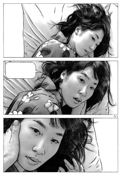
Number 1: - Chinese - Ardour by Wu Rou Xuan. Image via
 ![[livejournal.com profile]](https://www.dreamwidth.org/img/external/lj-userinfo.gif) telophase.
telophase.
Number 2: - Japanese - Baku by MIZUKI Hakase. Image via sub_divided.
Number 3: - Korean - Beat by Lee Young Hee. Image via octopedingenue.
Number 4: - Korean - Ciel by Rhim Ju-Yeon. Image via lady_noremon.
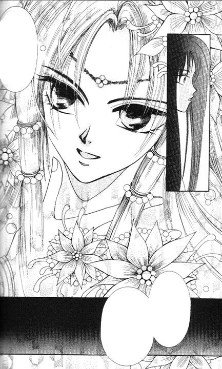
Number 5: - Chinese - Clair de Lune by Fanny Shen. Image via telophase.
Number 6: - Korean - Comic by Ha, Shi Hyun. Image via octopedingenue.
Number 7: - Chinese - Comic Dream by Huei-Yuan Chen. Image via telophase.
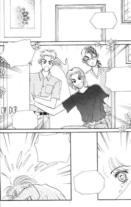
Number 8: - Japanese - Darling I Love You by MAMAHARA Ellie & IOKA Noeru. Image via lady_noremon.
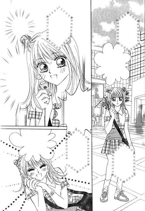
Number 9: - Korean - I Wish by Hyun Ju Suh. Image via lady_noremon.
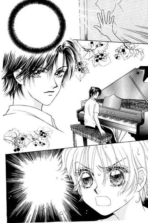
Number 10: - Japanese - Mainichi Seiten! by SUGANO Akira (artist), NINOMIYA Etsumi (author). Image via sub_divided.
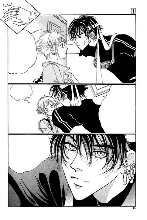
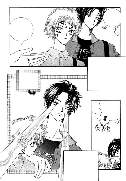
Number 11: - Japanese - Penguin Revolution by TSUKUBA Sakura. Image via sub_divided.
Number 12: - French - Pink Diary by Jenny. Image via telophase.
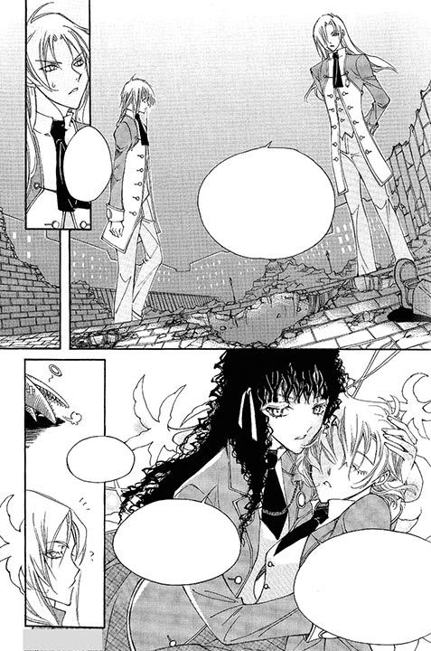
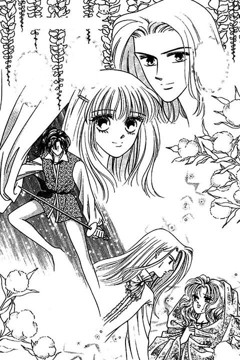
Number 13: - Korean - Queen's Knight by Kim Kang Won. Image via rayechu.
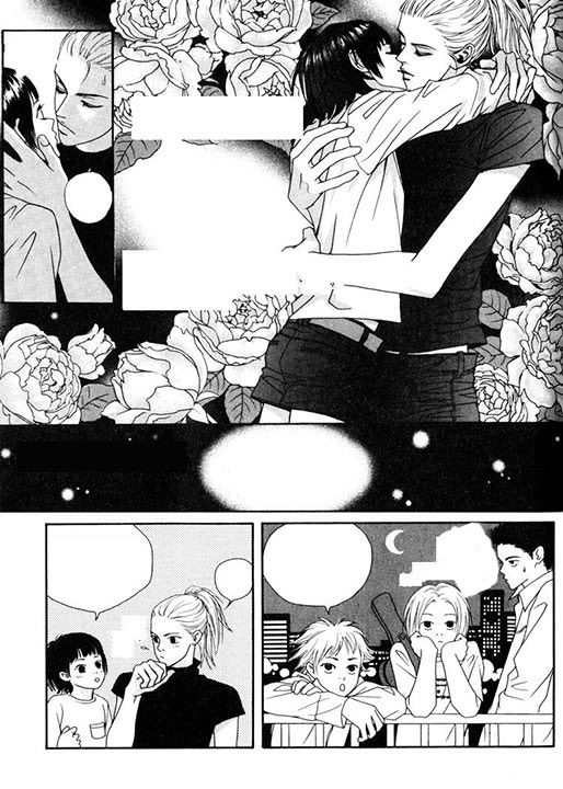
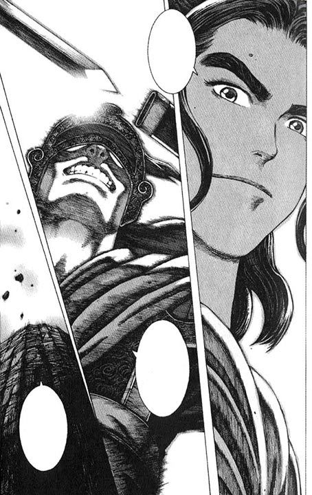
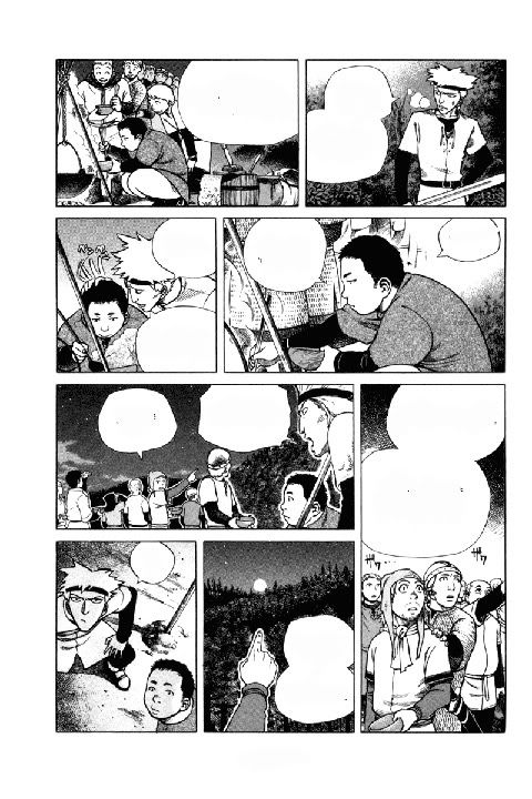
Number 14: - Chinese - Ravages of Time by Chan Mou. Image via telophase.
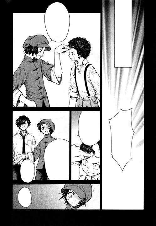
Number 15: - Japanese - The Story of Beijing Opera by Ueda Hiroshi. Image via telophase.
Number 16: - Japanese - Tokyo Renaikitan by Saekurako Gokurakuin. Image via lady_noremon.
Number 17: - French - Yukiko's Spinach by Frédéric Boilet. Image via telophase.
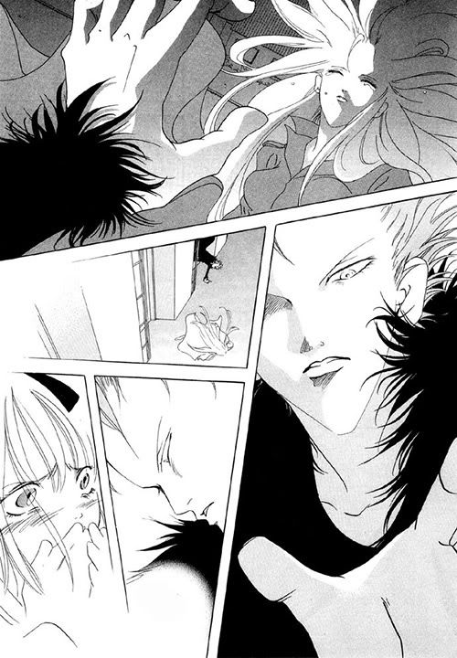
Number 18: - Japanese - Vampire Game by Judal. Image via rayechu.
Number 19: - Korean - Vanilla Ice by Kim Woo Hyun. Image via lady_noremon.
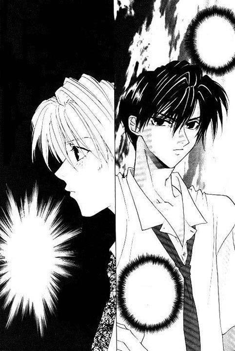
Number 20: - Japanese - Vinland Saga by YUKIMURA Makoto. Image via sub_divided.
Number 21: - Thai - Tom Yum Goong by (I couldn't find the artist or author on this one. It's a manga version of the Tony Jaa movie.). Image via telophase.
Number 22: Duh.
Number 1:
 - Chinese - Ardour by Wu Rou Xuan. Image via
 Number 2:
 - Japanese - Baku by MIZUKI Hakase. Image via
 Number 3:
 - Korean - Beat by Lee Young Hee. Image via
 Number 4:
 - Korean - Ciel by Rhim Ju-Yeon. Image via
 Number 5:
 - Chinese - Clair de Lune by Fanny Shen. Image via
 Number 6:
 - Korean - Comic by Ha, Shi Hyun. Image via
 Number 7:
 - Chinese - Comic Dream by Huei-Yuan Chen. Image via
 Number 8:
 - Japanese - Darling I Love You by MAMAHARA Ellie & IOKA Noeru. Image via
 Number 9:
 - Korean - I Wish by Hyun Ju Suh. Image via
 Number 10:
 - Japanese - Mainichi Seiten! by SUGANO Akira (artist), NINOMIYA Etsumi (author). Image via
 Number 11:
 - Japanese - Penguin Revolution by TSUKUBA Sakura. Image via
 Number 12:
 - French - Pink Diary by Jenny. Image via
 Number 13:
 - Korean - Queen's Knight by Kim Kang Won. Image via
 Number 14:
 - Chinese - Ravages of Time by Chan Mou. Image via
 Number 15:
 - Japanese - The Story of Beijing Opera by Ueda Hiroshi. Image via
 Number 16:
 - Japanese - Tokyo Renaikitan by Saekurako Gokurakuin. Image via
 Number 17:
 - French - Yukiko's Spinach by Frédéric Boilet. Image via
 Number 18:
 - Japanese - Vampire Game by Judal. Image via
 Number 19:
 - Korean - Vanilla Ice by Kim Woo Hyun. Image via
 Number 20:
 - Japanese - Vinland Saga by YUKIMURA Makoto. Image via
 Number 21:
 - Thai - Tom Yum Goong by (I couldn't find the artist or author on this one. It's a manga version of the Tony Jaa movie.). Image via
 Number 22: Duh.
no subject
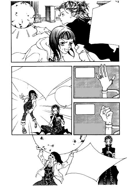
Snow Drop and Threads of Time (along with the gift shop) have that eyes-and-lines similarity going, I think - I'm at work and can't double-check (and I think I ended up selling Snow Drop to Half-Price Books after I got bored with the story). Demon Diary ... I can't quite recall. I'd have to look at it again.
no subject
And in case it wasn't clear, for whatever reason, this is *not* a style that seems to resonate with most American readers. With few exceptions (Demon Diary being one), the Korean books sell horribly.
no subject
[Unknown site tag] and I noticed that some of the Korean manga also tended to have huge hands.
By the way, this is me hoping that Threads of Time sells well enough to make it to the end of the story - the story itself is bogging down, but oh my God I love the art. (I guess that means that if it's discontinued, I could just go buy the Korean volumes and totally not miss the story.)
And, dammit, this has nothing to do with Korean books but is a random cry of want-it-now angst: I want my Qwan 4!
no subject
no subject
And just not enough awareness before books hit shelves. Even now, most Japanese series have at least *some* fan awareness, but very few Korean ones do, and so the book has to really go above and beyond to get noticed at all.
Threads of Time is hanging in there. But yeah, Qwan 4! *wants* But go read Suikoden while you wait, or, if you're up for gruesome vampire stories, Bloodsucker: Legend of Zipangu! It's better than the title would lead you to believe.
no subject
I also think the styles are great >^_^<
I only own one manhwa "Boy Princess" ("Kiss Me Princess), as a GN. I HATE how the company printed/localized it :( though it does bring back memories of Viz's old flipped manga (which were larger then the 'pocket' gn today...I wish manga wasn't published in 'pocket' size...)
My favorite company is DelRey! I wish more companies published manga in the quality/format as DelRey is putting out "xxxHolic", and DMP put out "G-Senjou no Neko".
I want to get "Tarot Cafe"! :3
and do you work for TokyoPop? You user pic reminds of one of the editor's chibi pics, in the back/suggestions...
no subject
Tarot Cafe is great, though!
Ah, DelRey. I find them to be hit or miss, personally. When they're good, they're very very good (xxxHolic is a good example), but getting high praise for format/quality when their font use is so incredibly lame? Well... Not that TP isn't inconsistent with stuff, but what and how they choose to translate (and then footnote, or not) is always kind of interesting to me.
But yes, I am in fact the TOKYOPOP editor in the chibi. :-) That's me!