Entry tags:
Part 3
OK, I have NOT uploaded any examples of what I was originally talking about - amateur artists - because of that whole "not wanting to look like I'm ripping someone apart when they didn't expect it" thing.
So this is a slightly different question - what similarities and differences do we see between Japanese shoujo and OEL shoujo?* The pool of candidates I have here is a slightly biased one, being books that I have on my shelves currently, because I recently took all the manga whose art I didn't like and put it in a box to go to Half-Price Books. :D
* We're ignoring that purists will claim it's not true shoujo if it's not Japanese. Maybe not, but it's borrowing heavily from Japanese shoujo, and thus I'm using the term. So, bleeah.
The pictures link to larger versions. I chose these particular spreads based on them being enar the beginning or ending of the book, to make it easier to smash down on my scanner, and to not give away too much plot. There wasn't a whole lot of picking and choosing other than that.
What differences can you find between them, in general? What makes them similar?
Japanese shoujo:
Everyone's faaaavorite hate-to-love-it manga, Hot Gimmick:

And now we have the classic lovable-bad-boy MARS:

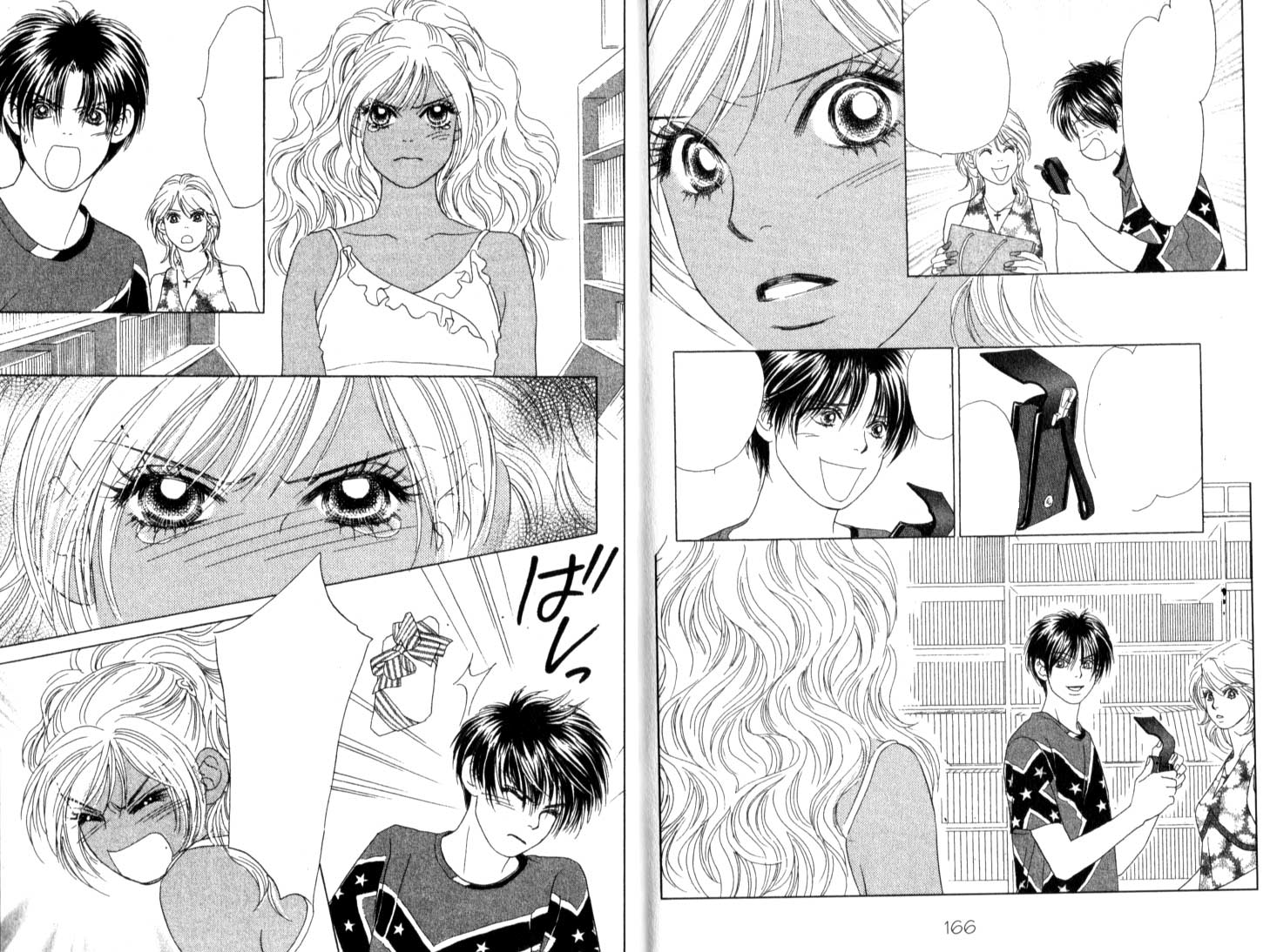
My candidate for the Most Number of Characters I Want To Slap Award, Peach Girl: Change of Heart:

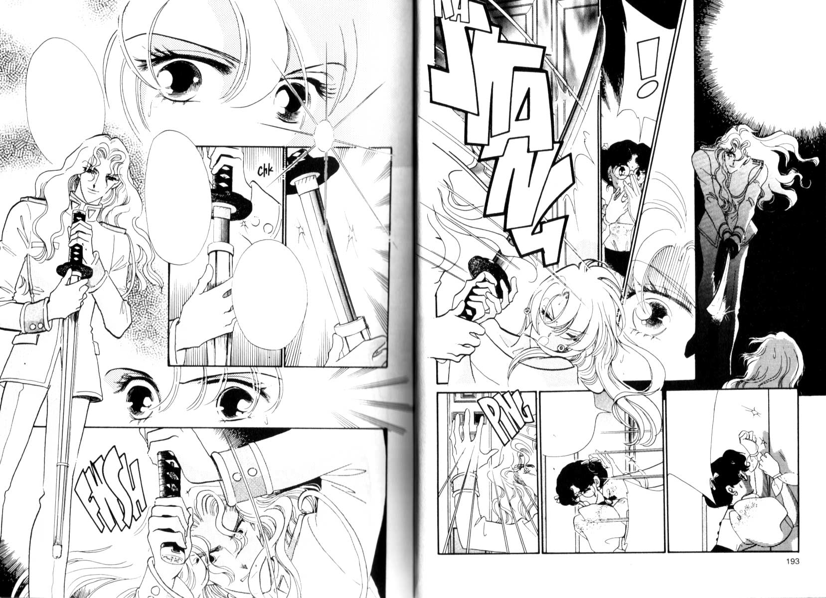
And the so-shoujo-it's-a-parody winnar, Revolutionary Girl Utena (read left-to-right - this one is from an early, flipped, edition):

OEL shoujo:
YOU MUST FORGIVE ME - I'd scanned in all the Japanese ones, and when I was cleaning up Dramacon I realized - the most obvious thing that was making it look different, to me, was the size of the text and the lack of space in the text balloons. And I wasn't about to re-scan all the Japanese ones to leave the text in for you to compare, so you'll have to crack open your own Japanese shoujo and take a look at the amount of whitespace in the balloons.
Read all of these left to right.
Svetlana Chmakova's Dramacon, no messing with the text:

Dramacon with the text at 75% of the original size:

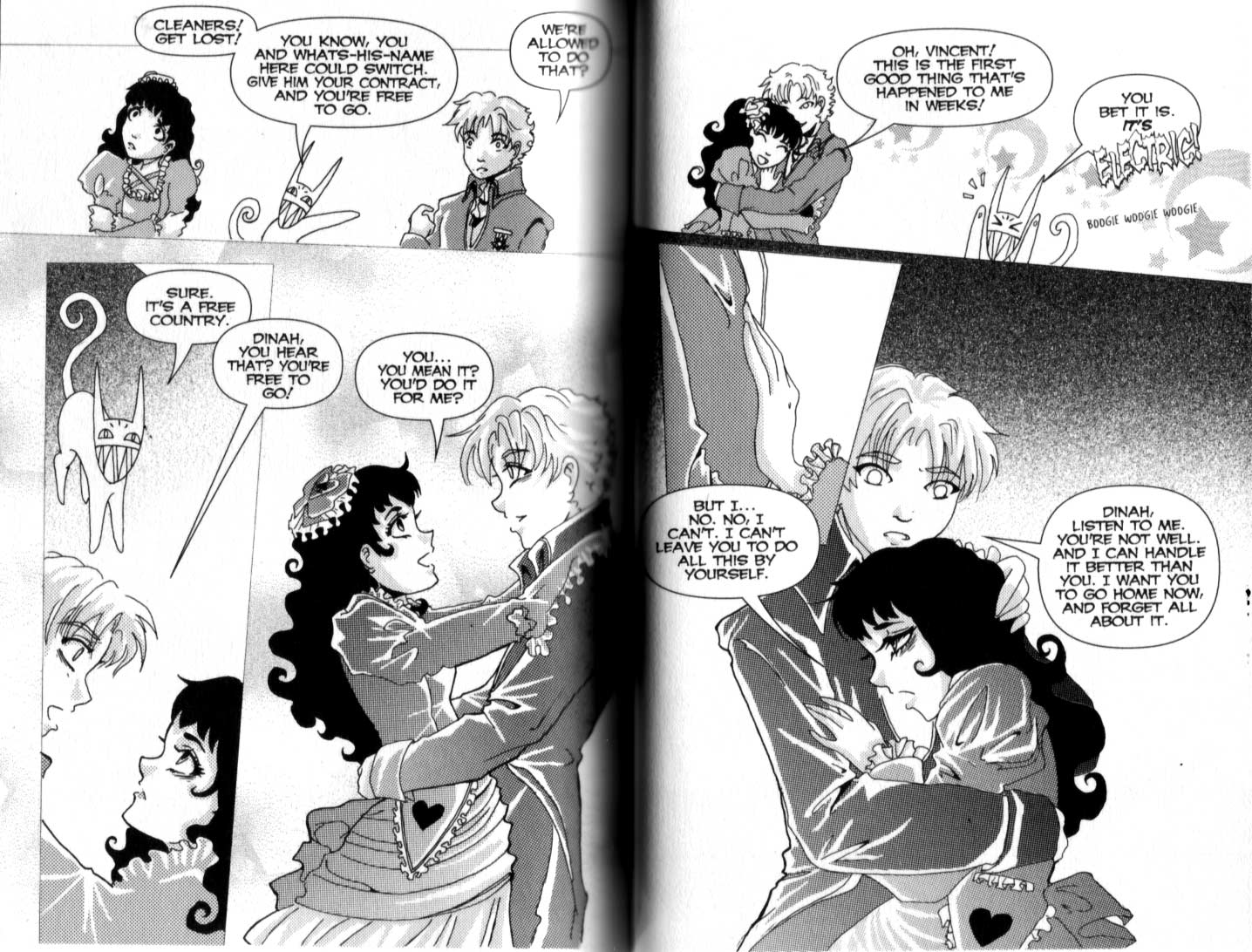
Marty LeGrow's Bizenghast:

Rikki Simon & Tavisha's Shutterbox:

Rivkah's Steady Beat:

And here's one that illustrates one of the major themes brought out in the comments on the last post: the importance of graphic design. In the four books of Clover CLAMP took that and pulled the graphic design out and made it the primary focus of the book. The pages are all beautiful and well-designed, often the design being focused on over the story and the coherence of the visual flow. It's an interesting experiment that, for the most part, works, and is the reason why this is the only CLAMP series to remain on my bookshelf, because I have a Thing about CLAMP.
Clover. Read left-to-right - this edition was flipped:

Differences I see:
1) Japanese manga lines are more delicate.
2) Use of tails on speech balloons in OEL manga to indicate speaker, instead of relying on location of balloon and context, in addition to the lack of whitespace. This is the most obviously Western-influenced aspect, to me at least. (I'm not mentioning the vertical orientation of the Japanese balloons and the horizontal orientation of the OEL balloons, because that ought to obvious why they're that way to anyone. XD)
3) More clear line of visual flow in Japanese manga.
4) The character designs in the OEL seem to be more reminscent of shounen manga than shoujo - they're more solid than the wispier Japanese ones. Partly a result of linework, but also partly the result of the Japanese character designs concentrating on and detailing out of ENOURMOUS DARK LIQUIDINSECT EYEBALLS. All four of the Japanese spreads up top feature eyes prominently. None of the OEL ones do.
5) I get more of a sense of page-level graphic design in the Japanese ones than the OEL. Rivkah's is the most consciously designed of them, but isn't quite as ... er, fully designed? That's not the term I'm looking for, but I can't figure out what it is that I'm looking for.
Three out of four of the OEL examples are by artists comparatively new to the professional field, while the Japanese examples are all, to my knowledge, drawn by experienced manga artists. This may account for a lot of the differences - for example, I know the problems I see in Bizenghast are almost all due to LeGrow's (relative) inexperience, and in future years she'll be much more polished. The Japanese ones are usually drawn by teams, while three of the four OEL were drawn by individuals. I'm not sure how much division of labor was involved in Shutterbox, and I know a lot of the Bizenghast toning was done by someone else, but I think the most number of people working on any given OEL here was 2. Whereas, the Japanese could possibly have 4 or more for each, but I don't know for sure how many assistants worked on each given story.
Going to bed now. Eagerly await morning and the flood of OMG U DUN NO WUT UR TALKIN ABOUT LJ notifications. XD no, really, I loved all of the comments on yesterday's posts - they were *all* thoughtful and informative
So this is a slightly different question - what similarities and differences do we see between Japanese shoujo and OEL shoujo?* The pool of candidates I have here is a slightly biased one, being books that I have on my shelves currently, because I recently took all the manga whose art I didn't like and put it in a box to go to Half-Price Books. :D
* We're ignoring that purists will claim it's not true shoujo if it's not Japanese. Maybe not, but it's borrowing heavily from Japanese shoujo, and thus I'm using the term. So, bleeah.
The pictures link to larger versions. I chose these particular spreads based on them being enar the beginning or ending of the book, to make it easier to smash down on my scanner, and to not give away too much plot. There wasn't a whole lot of picking and choosing other than that.
What differences can you find between them, in general? What makes them similar?
Japanese shoujo:
Everyone's faaaavorite hate-to-love-it manga, Hot Gimmick:
And now we have the classic lovable-bad-boy MARS:
My candidate for the Most Number of Characters I Want To Slap Award, Peach Girl: Change of Heart:
And the so-shoujo-it's-a-parody winnar, Revolutionary Girl Utena (read left-to-right - this one is from an early, flipped, edition):
OEL shoujo:
YOU MUST FORGIVE ME - I'd scanned in all the Japanese ones, and when I was cleaning up Dramacon I realized - the most obvious thing that was making it look different, to me, was the size of the text and the lack of space in the text balloons. And I wasn't about to re-scan all the Japanese ones to leave the text in for you to compare, so you'll have to crack open your own Japanese shoujo and take a look at the amount of whitespace in the balloons.
Read all of these left to right.
Svetlana Chmakova's Dramacon, no messing with the text:
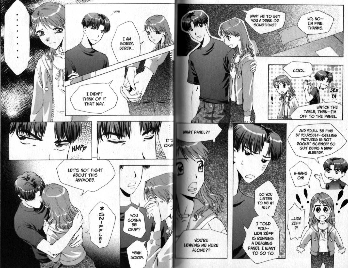
Dramacon with the text at 75% of the original size:
Marty LeGrow's Bizenghast:
Rikki Simon & Tavisha's Shutterbox:
Rivkah's Steady Beat:
And here's one that illustrates one of the major themes brought out in the comments on the last post: the importance of graphic design. In the four books of Clover CLAMP took that and pulled the graphic design out and made it the primary focus of the book. The pages are all beautiful and well-designed, often the design being focused on over the story and the coherence of the visual flow. It's an interesting experiment that, for the most part, works, and is the reason why this is the only CLAMP series to remain on my bookshelf, because I have a Thing about CLAMP.
Clover. Read left-to-right - this edition was flipped:
Differences I see:
1) Japanese manga lines are more delicate.
2) Use of tails on speech balloons in OEL manga to indicate speaker, instead of relying on location of balloon and context, in addition to the lack of whitespace. This is the most obviously Western-influenced aspect, to me at least. (I'm not mentioning the vertical orientation of the Japanese balloons and the horizontal orientation of the OEL balloons, because that ought to obvious why they're that way to anyone. XD)
3) More clear line of visual flow in Japanese manga.
4) The character designs in the OEL seem to be more reminscent of shounen manga than shoujo - they're more solid than the wispier Japanese ones. Partly a result of linework, but also partly the result of the Japanese character designs concentrating on and detailing out of ENOURMOUS DARK LIQUID
5) I get more of a sense of page-level graphic design in the Japanese ones than the OEL. Rivkah's is the most consciously designed of them, but isn't quite as ... er, fully designed? That's not the term I'm looking for, but I can't figure out what it is that I'm looking for.
Three out of four of the OEL examples are by artists comparatively new to the professional field, while the Japanese examples are all, to my knowledge, drawn by experienced manga artists. This may account for a lot of the differences - for example, I know the problems I see in Bizenghast are almost all due to LeGrow's (relative) inexperience, and in future years she'll be much more polished. The Japanese ones are usually drawn by teams, while three of the four OEL were drawn by individuals. I'm not sure how much division of labor was involved in Shutterbox, and I know a lot of the Bizenghast toning was done by someone else, but I think the most number of people working on any given OEL here was 2. Whereas, the Japanese could possibly have 4 or more for each, but I don't know for sure how many assistants worked on each given story.
Going to bed now. Eagerly await morning and the flood of OMG U DUN NO WUT UR TALKIN ABOUT LJ notifications. XD no, really, I loved all of the comments on yesterday's posts - they were *all* thoughtful and informative
no subject
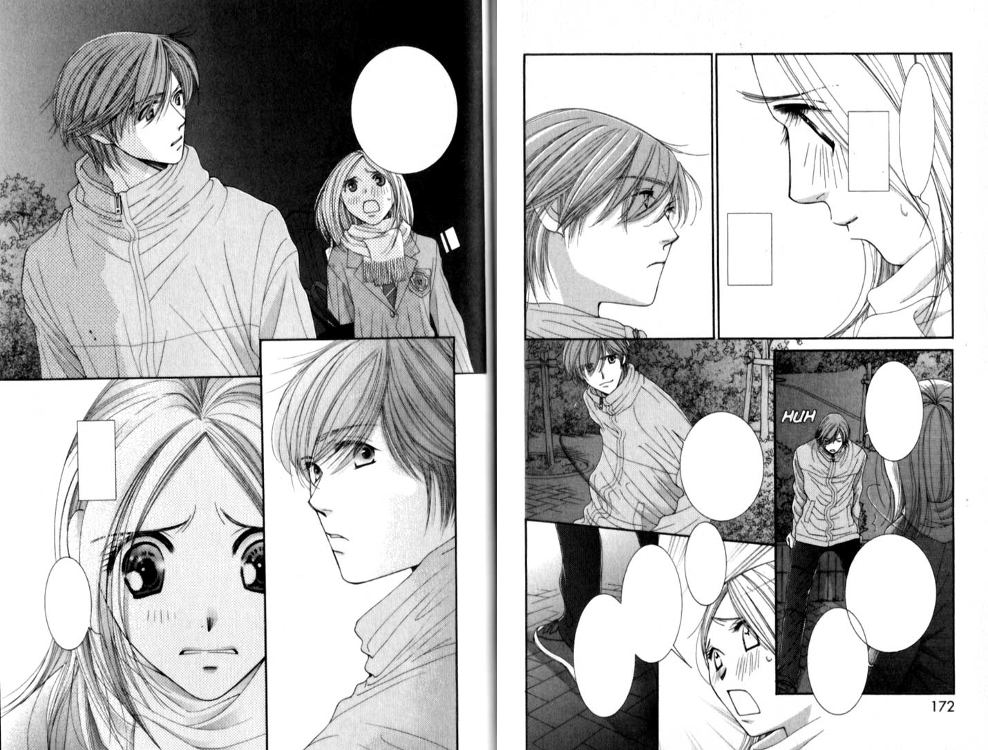
The primary difference I notice is that the Japanese Shoujo focuses a great deal on expression, especially that of the eyes. How do they accomplish this? Close-ups galore!
Pardon the lack of wit.
Thank you.
no subject
no subject
no subject
It must be kind of a Western perception thing too, because I was looking at my proof for Sorcerers & Secretaries today, thinking, "Good lord, these balloons are giant, and really empty. I thought I told Layout to up the font size." But in retrospect, the book may well be better for the slightly smaller font. I'll have to keep that in mind.
no subject
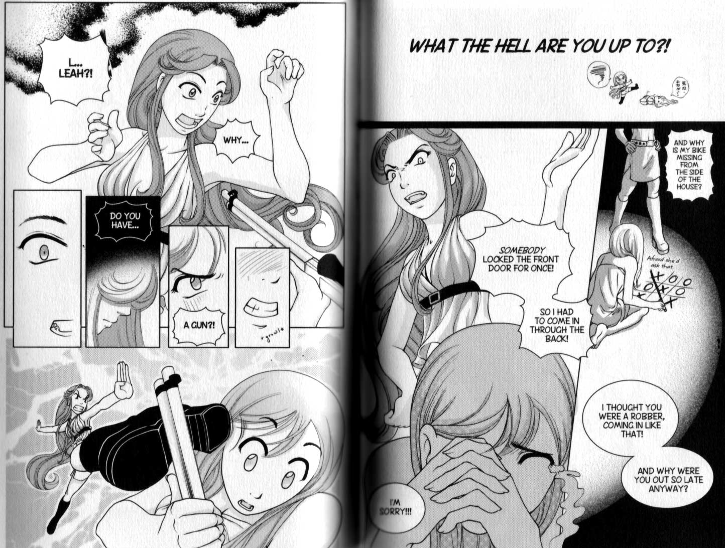
I hate to pick on Bizenghast, but it's the weakest of the four OEL up there, and part of that is due to the balloon design and placement, I think - the text crowds the balloons, plus they look like they're placed in as afterthoughts, in an attempt to avoid blocking the art. On the first page, the strong horizontal on the bottom two panels is distracting, and the looong tail doesn't do anything for the design - I'd have expanded the balloons and moved that second one "Dinah, you hear..." down. On the second page, the final balloon could have, I think, been bigger and more vertical, so the lones of the text were slightly shorter, and place a bit higher, to allow the negative space formed by Dinah's hair to breathe, instead of being almost hidden.
But that's all speculation, until I sit down and take the balloons out and mess about with placing them to see what would really look better. XD
no subject
no subject
no subject
And then there's Death Note, the ultimate in slapping balloons over everything. XD
no subject
I've noticed that, too. When I originally ballooned and lettered "Steady Beat," there was a lot more coverage (I guess you could say) of balloons over art. It directs the eye better. But when it was relettered and ballooned in-house by TP, the letterer seemed almost afraid of covering up my art. Drives me NUTS!
They don't get to letter book 2. :P
no subject
Not that I've really solved that problem myself yet, but it's something I've working on. :D
no subject
From what I've seen of OEL so far in general, I've always had the impression they were more influenced by anime than manga actually, drawing style wise that is. Partly because I've also always had the impression that anime was a bigger thing in the US than manga is, but possibly that's changing by now? :x
no subject
Manga's starting to grow - after all, Cosmo Girl is running a manga in its magazine every month - but it's still way behind anime in the wider culture. The wider culture often doesn't realize that what they're watching is anime.
no subject
What I also wanted to mention:
The layouting in Japanese manga also depends on the editors; they take a red pen and draw over your scribbles as to what to change, can be a lot if you haven't got much experience or just haven't been long in the business. I always thought Japanese doujinshi in general had much less of the visual flow thing than professional published manga. Of course also because doujinshi artists usually are amateurs, but I'm comparing with the very first works of pro mangakas.
no subject
For example/comparison, Hot Gimmick (night scene) in comparison to the Dramacon pages. Which uh, is actually a _reversal_ of what I just said. Er. Hot Gimmick uses a large area of black-fade-to-gray exclusively in actual environment shots, to make it a night scene. (In fact, Utena does this as well, in using the black exclusively to show that it's a stage with a spotlight.) On the other hand, Dramacon uses black areas for emotional impact, or -- I suppose that chair on the first panel, second page, is in a dark room or something? (Don't know the story.)
Anyways. Whoa, random thought -- I think what's hindering the immediate readability (ie, the "at a glance" visual narrative) is that the OEL manga tend to have very even distributions of tones. That is, the blacks and whites are balanced. If I squint at the pages, nothing really "pops" out, or weird things pop out. Uh, this is the negative space thingy you were talking about, I guess.
One last random thought: I wonder if it just isn't a matter of people using screentone as graytones/"colour" as opposed to screentones as graphic shapes. ^^;
no subject
I think you're right about the use of screentones. I've been seeing that in a bunch of amateur web stuff lately, and I'm guilty as hell of it myself - using the screentone as shading and shadows rather than as graphic design elements.
no subject
Dramacon... There's something about that scan that I like more than the others. The scene seems similar to MARS. But with MARS, there's alot of close-ups and Dramacon seems a bit more detached. It depends on context, I guess.
no subject
MARS sucks you in more because of teh focus on the eyes and the expressions, I think. Dramacon is using more body language than subtle facial expression. Svetlana's the most obviously shoujo-influenced of all of the OEL, though.
no subject
no subject
And that scene at Dramacon - the chair is in a separate panel from the character, so there's no way to locate it in relation to the characters - without having read the pages before, you don't know if they're remembering it, if it's where someone else is supposed to be but who isn't showing up, if *they're* supposed to be there, or what. The hints you're getting, however, end up relating to the emotional setting of the scene and not the physical setting, because they're actually having it out directly in front of that table in the middle of the day in the artist's alley at the convention. :D
Part 1 (because my reply got too long)
To add to my 'design' comments in the other post, The pages you show really just reiterate my point.
Take the first scan: It's a big, and wonderfully balanced X shape. The upper left and lower right are busy/dark, while the upper right and lower left have a lot of pale white space-- but it's also got the large facial close ups. It gives the eye time to rest, balances the darks and it also yanks the eye around in a far more quiet, and quicker manner than having to force the reader to drag their vision across specific panels. you can glance at the whole page and understand what the tone is before you really sit and start reading what's in the word balloons.
Same with the second page: There are large faces in the center, with progressively smaller panels and images fanning out at the sides. It picks up the pace, and then slows the pace again much like the way a bar of music does when rising up the scale. This is added with the liberal amount of dark greys that are stuck on their clothing. Note that there aren't many other tones on that page that aren't on the darker scale-- which, also balances against all the white that page has.
Same with the Peach girl page: Lots of extremely busy grey areas that are placed next to the less busy dark areas to make sure they don't pop out too much, while at the same time they also ensuring that they _do_ pop out.
OEL-- definately far less designed in comparison to the others.
Take a look at the page from Bizenghast, for example, the pages at first glance seem bottom heavy because all the darks are in large areas at teh bottom, while the small panels at top are light. This creates a sort of mind/eye drag.
Shutterbox is pretty balanced single page-wise, but it doesn't pay attention to how the page will look with the second page next to it. >_> The artist seems to have paid attention to the layout of the single page. But with the other page-- it just looks completely squashed and a real visual distruption.
Steady Beat seems the most designed out of the previous ones, but... I'm bothered by the big white box on the top right becaus eit's so clear and clean and big... while the rest of it feels very grey and black. That's the only think that really throws it off.
As for Clover (OMG I it's one of the only CLAMP things I ever grabbed right off the shelf when it first came out-- it's so beautiful) -- it makes my designer's heart sing. Here is a great (if more literal) example of how blacks work against whites, and how abstract text tends to be visually scanned by a reader. :P Doesn't work for every page, but as a whole, it's gorgeous. And yeah, it helps that it wasn't the artist doing it but an actual designer they got to really rip their art up and stick it together.
Part 2
Uhm... both pages have a very similar flow-- "black/white, sideways sideways, down" that works nicely. Both "down" is either done with a large image as an anchor point, or a large image acting as a 'slide'. BOth of these give a strong mass-- another thing that artists have to be careful of. The bottom panel is important because it's a little heavier than the one that appears on top. (by sheer fact that it's on bottom) You don't want to have a huge, heavy image at the bottom of the page if there's nothing on any of the other sides to balance it out. It'll completely dominate the page and the page next to it, otherwise.
I... think I babbled enough. D: I'll run now.
Part 3
The art individually is fine for all the OEL, not my thing, but it's not bad art at all. I like how all those artists tend to have a much greater mass/very solid feel to their art compared to teh shoujo pages...It's just the way most of it that's presented makes constantly feel as I'm slamming into panel walls, or large blocks, or having things dangle.
I'm actually weirdly reminded of a shoujo cross with the likes of.. uhm. Basilisk. Or Berserk, where there's a lot of heavy greys and strong lines used? Take CLAMP and slam it together with the toning/inking styles of those two and you get the sort of feel I'm getting from those particular OEL. It's pretty interesting.
-----
Now after typing all this, I realized that it really wasn't what you asked for at all, was it? Gah D:
Uhm! To make this reply relevant--
All the balance and style issues that I entioned before are their differences. Simliarity-wise, I think that it's probably both content and lakc of backgrounds. :O Oddly enough, I'm not getting any of the typical 'shoujo feel' due to the style differences.
those pages are a lot stronger, meatier, fleshed out... uhm.. have a lot more MASS compared to the shoujo pages. The way the pages are balanced out adds to to weighed feel of the OEL,the shoujo pages are a lot 'lighter on the feet', but it's also the lines and the sparse use of darks. (and when the darks do show up, it's REALLY dark) higher contrast with a focus on pastels? :P
While I get the sense that the OEL would be in the darker color scale in comparison.
Re: Part 3
Another off the top of my head comment, but, I agree that the use of heavy grays/strong lines is not a bad style in and of itself. I think where it becomes problematic, in these examples at least, is how crowded it ends up. If you look at Basilisk and Berserk and etc, they have very rendered and detailed style, but I think they also have a lot less going on with each page (both in action and text). (Likely the exception to this is the evil Death Note, but that's another story. DX ) They rely a lot on extreme closeups, whereas the OEL manga have a lot of torso shots (which seem to call for environments). Japanese manga is also in love with cropping, of faces, body parts, or panels going off the page or parts of people overlapping in other panels.
Hm, I don't remember if you remember looking at G Senjou Heaven's Door. Looking at its word balloons and its "thick" inking style, it's actually very close to "American" style, at first glance. (Actually, I don't remember if you even liked it. XD ) (And now, I'm looking through a bunch of my manga and staring at word balloon spacing. Sob. Interestingly enough, out of shounen comics I have, Morita Masanori appears to use the most spacing. :O )
But anyways, back to talking about shoujo specifically. :} I wonder if a lot of the problem is also a matter of how it's easier to design vertically but easier to narrate horizontally. If that makes sense, or is perhaps a specifically Western problem due simply to the way our writing systems work. I think Japanese/Korean/Chinese has that advantage in that their ability to "read" can go horizontally just as easily as vertically or diagonally. (This is probably a factor in why a lot of people have difficulty reading unflipped manga or more abstractly paneled manga as well?) Western type (and by extension, reading) just wasn't designed to read any way but left to right in a marginally straight line, so you're a lot more limited with how you design word balloons. Because let's face it, sentences that look like haiku poetry really aren't that fun to read...! Hence why Western comics seem to work better as storyboard type panels?
Re: Part 2
(Anonymous) 2005-12-07 01:37 pm (UTC)(link)Shoujo is just comics that are targeted towards girls of a certain age group, isn't it? >_> Technically, if the OEL are romance stories targeted at teen girls, it'd be Shoujo too.
OMG, I'm totally talking too much. I'll stop for real now.
Re: Part 2
Yeah, but there's a lot of style issues involved, too, so you can say something has a shoujo look or uses shoujo techniques. :D
no subject
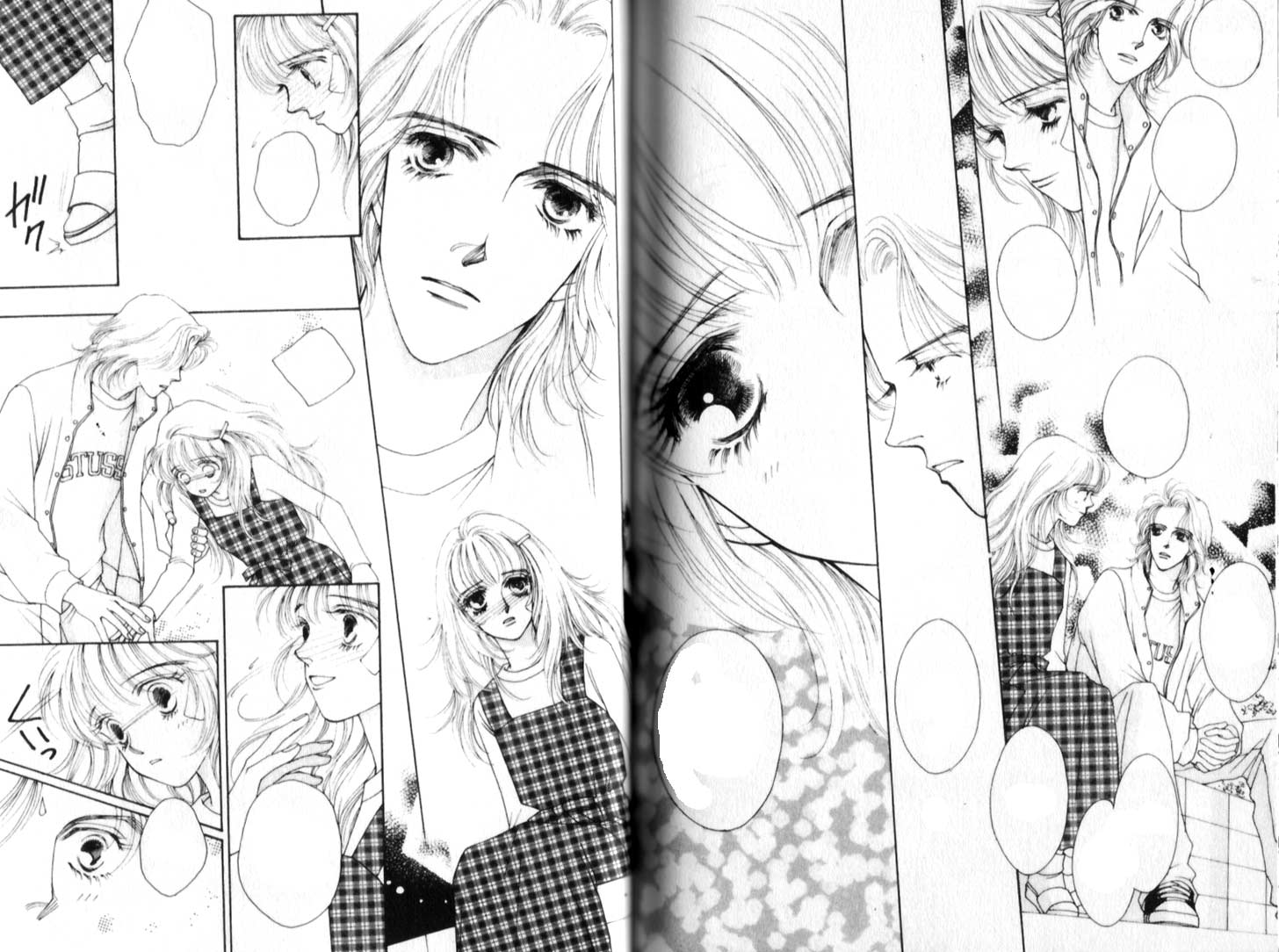
One of the things I've always noticed is the action flow. Things always seem to teleport around in OEL manga. For example, the Shutterbox sample. The man drinks from a teacup, then it travels down, and suddenly, no teacup.
In Utena, you see the katana several times, in several stages; Saionji holds it up, then draws it slowly, then hacks at Utena in the next page. The flow is constant.
As much as I hate to sound like a fanfic writer, the shoujo manga does more "Show, not tell" than the OEL manga do. Important scenes often have the characters standing in the same pose with very minute changes, only different angles and focus. The peach girl sample is the best example. Boy talks to a girl. Girlfriend notices, the focus shifts to the item, then to the boy, and up back to girlfriend, telegraphing the shift of attention. Same area, same poses -- the boy & other girl character shift poses with the focus, and turn to girlfriend, & snap! the action picks up, so you have the present thrown at boy and girl half-turning to go-- you're expecting her to leave the scene by the next page. In the background, there's a bookshelf shown at least once in both pages, so that you're always grounded as to where the characters are, and where the camera is coming from.
Dramacon was done with a jerky 'camera', like a photo slideshow -- characters jump jump jump from panel to panel. They're doing absolutely different motions and I honestly get tired trying to figure out how character A's pose went from point A to point M. It's the same with Bizenghast.
In Steady Beat, the action flow is much better, but somehow the action isn't broken up very well. The exclamation should have been paired with the flying kick; not broken up in two pages, it's like two stutters instead of a snapshot. The focus is sort of weird as well; the crying girl is dominant, while the intimidating one is in the background, and it's weird because the girl in the background is the one speaking, and she should literally seize attention, because she's angry, and the other one is cringing and should be whispering her apology.
I'm so not touching Clover, because it's stylistic in the This Is Art, Peasant kind of way.
It's the difference between an experience filmmaker and a amateur home video, I guess. Perhaps OEL's should take a leaf from Yoshinaga Fumi, who can do talking heads and still make it look good.
no subject
The focus is sort of weird as well; the crying girl is dominant, while the intimidating one is in the background, and it's weird because the girl in the background is the one speaking, and she should literally seize attention, because she's angry, and the other one is cringing and should be whispering her apology.
Looking at it, I think if Rivkah had had Leah (the angry character) *not* cut off by the white box, but had her head and fingers overlap it, it would have worked because she would be popping out over her sister as she lectured her.
no subject
Re: page layout--WTF is up with the circular speech balloons in _Shutterbox_? And even _Steady Beat_--that gun brings me down and right, and I end up reading the row of small panels backwards.
The OEL ones look weird and less interesting, but I can't put my finger on why. Some of them look more like newspaper comic strips, maybe?
Hmm, that's it for now from a reader's perspective.
Borders and Margins
The OEL doesn't have that. I was looking L to R, and the left side does have a border. But the right side isn't weighted with anything, the characters aren't looking to the right corner, there isn't a small rectangle with stuff in it. Dramacon should have had the guy and the girl looking right, not dead on, or left. The last Bizhenghast scene is too centered and static. Shutterbox's eyes are looking back at the page, and NOT off to the side, so it feels too insular. Steady Beat is much better, because it's got the dialogue balloon trailing downward, but it would resemble shoujo more if it was accompanied with a small rectangle scene of a person looking/facing right and downwards.
I'd say that Steady Beat most resembled shoujo.
no subject
I think, though, that I noticed this in part because the Japanese shoujo pages have more close-ups of faces and eyes, which puts those character designs to work.
I see Steady Beat has at least two panels of eye close-ups, which I find far less affecting than those in MARS and Utena probably because the eyes on that character are smaller, less detailed, more cartoony than Utena's and whoever-that-girl-is's eyes.
no subject
So, beautiful and delicate characters; this immediately reminded me of a comment someone made about Tale of Genji, in which being ill is sort of sexualized, or at least there are lines drawn between being sick and beauty. Things being frail or delicate and beautiful, or more beautiful because they are frail.
Ugh, this is coming out all stilted. And worse, I don't really have a point, I'm just drawing strange parallels.
no subject
no subject
A lot of people have mentioned this the emphasis on eyes and expressions, but I'll throw in that most of the shojo pages have at least one panel without any text, and usually more, very frequently for "reaction shots". I wonder if this is so much an American vs. Japanese difference as a beginner vs. established pro difference; you can see the same progression going from, say, Fushigi Yugi to Fushigi Yugi: Genbu Kaiden. I think of it as similar to the problem film and TV writers have, which is sometimes you need to let go of the words and trust the actors; in comics, it's you need to let go of the words and trust the art. I always thought of this as very verbally-oriented people, writers, having trouble letting go of control of the medium they most prized, but I'm beginning to think of it as more of an experience issue, if only because most of the OEL creators seem to have a stronger background in art than in writing.
no subject
Hmm . . . I've posted a couple of my pencils for volume 2 on my LJ, and I'm curious if you think the layout's progressed, at all . . .
no subject
(This is Tentopet/Amy Hadley)
(Anonymous) 2006-01-03 09:04 am (UTC)(link)Urm (so embarrassing when I ask people online because I feel like I should know) so DO you have a book deal yet?? I'm confused why you wouldn't yet unless it's by your own will.
But yeah anyway thanks for taking all this time to delve into things that I'd never think of on my own. Seriously. I've learned so much! And I am soooooo guilty of placing balloons where it won't cover my art. Sheesh. Whenever I place them I get such a headache trying to figure it out, so I'm sure this'll help! And this whole idea of leading into panels--I did it a little, usually by mistake and then pretending it was on purpose, but I'll be sure to pay more attention to that now. By the way, if you ever feel an inkling to critique my stuff or compare it or whatever PLEASE DON'T HESITATE!!! Whatever leads me in the direction of improvement is greatly appreciated. But ya know if you're busy I don't want to inconvenience you ;)
Oh! And also in reading this, I've been thinking a bit about the difference between OEL tendencies that may be a good change and ones that are definitely a reflection of inexperience. Like the idea of OEL shoujo actually having very shounen trends in character design and lines. That, to me, may not be a bad thing. I do think some of these could use more detail in the eyes, but some of these hybrids could turn out pretty cool! I know you were just laying out differences, and I'm not sure ANYONE can properly decide which differences are okay and which aren't, though. And people talked about how complicated shoujo layouts are, but sometimes they're not. A lot of it depends on the content in that part of the story. Like Miki Aihara's layouts and how much she slaps in there depends totally on if it's a moment of reflection or if it's a moment that's more about dialogue and your run-of-the-mill stuff (that will later be reflected on). The run-of-the-mill stuff looks much more run of the mill layout-wise. I think this helps suck people in because if it's TOO ethereal then you never start to feel like you're THERE. And then there's comics like Tramps Like Us that are definitely shoujo (or I guess "josei" or something?) and yet they're much more grounded in reality and have less paneling insanity.
Re: (This is Tentopet/Amy Hadley)
No, no book deal yet -
I started doing the essays because
I have the problem of not wanting to cover my art with balloons, too, but I'm trying to overcome that, as well as making the visual flow clearer. And when examining other work, I have a tendency to look at OEL and evaluate it in terms of how it doesn't stand up to Japanese manga, when the creators really aren't trying to imitate Japanese manga, they're borrowing techniques from it. :D
Thanks for your comments! And for offering your work for examples - it's nice to know that someone won't explode at me if I use their stuff. :D
Jeeze
Re: Jeeze
wantyou~~
am..
tails on speech balloon...
It was embarassing..
anyway...
Clover is WANTYOU~
Re: wantyou~~
no subject
I also really noticed that the inking on OEL tends to be a lot thicker.Maybe it's my partial bias to reading less defined lines, however, in my own eyes I tend to find that bolder more defined cartooning is prevalent in American comics. Something that says "This is the border of the character" and then thinner lines inside to make the details.
Next is the flow, yes, Japanese manga seems to contain much better flow, but this, I believe isn't a problem with skill. Most American manga-ka I've known deal very little with assistants. I know Peach Fuzz's Lindsay has Jared to help out, but I'm not particularly sure on how many people help put together manga.
Assistants allow better more thorough use of careful tone placements, inkings, and layouts. They also tend to use photos as stock to carefully redraw in as a background image. Most American manga seems to lack this sort of "stock photo background."
I can go on, but I have a lab due tomorrow XP Thanks for letting me ramble.
no subject
I think that Japanese mangaka also work more closely with their editors than I think the American ones do, but I'm not entirely sure about that.
no subject
Also, because of the very large number of manga-ka, and their popularity, it's possible for people to steal original drafts of the pages via reg. mail, so a lot of them either have the reps come in to pick up the original, or go to the publishing house themselves to hand the finished product in.
In America, which is roughly the size of a whale compared to Japan which is about the size of California and very efficient on mass transit, I suppose that's just not financially feasable seeing as Tokyo Pop is in LA, Viz in SF.
About whitespace in balloons
(Anonymous) 2006-02-22 09:10 pm (UTC)(link)Copy editing your article for the March Manga Online today (loved your previous one, by the way)--I think you raise a lot of good points here. But you've not presented convincing evidence on the whitespace-in-balloons argument. First off, the English translations (Utena, Peach Girl) cannot be taken as guides to whitespace, because those are fitting horizontal English to a vertical bubble--naturally there will be a lot of whitespace left, especially at the top and bottom. And besides, the lettering in that English Utena looks like it's probably way smaller than the original Japanese--that's just a guess, but I doubt I'm far off. So anyway, we're left with the Japanese-lettered pages: MARS and Clover. And both of those examples really don't have much whitespace, certainly not more than the original whitespace in the Dramacon balloons.
I'm not saying that lots of Japanese manga (like Saiyuki) don't have a great deal of whitespace in the balloons. I'm just saying you didn't make your case in this article.
I think those Dramacon pages make good use of balloon whitespace, though the left page makes better use of it than the right. AND the OELs have the added advantage of the ability to use good lettering, centered and fitting the contours of the balloons (and the other way around)--though this ability is not always taken much advantage of; on the other side, the Japanese lettering is just a plain font aligned at the top with a very ragged bottom--not artistic at all.