Entry tags:
Dramacon and Off*Beat
Ended up getting two of the new crop of OEL manga today, Off*Beat by Jen Lee Quick and Dramacon by Svetlana Chmakova. (![[livejournal.com profile]](https://www.dreamwidth.org/img/external/lj-userinfo.gif) lilrivkah, I looked for Steady Beat, but neither the bookstore at lunch nor the one this evening had it, sorry!)
lilrivkah, I looked for Steady Beat, but neither the bookstore at lunch nor the one this evening had it, sorry!)
And I have to get to bed early tonight, because tomorrow is Thursday and this means I have to get into work early enough to beat all the student circling the parking lot like vultures, if I don't want to park four blocks away from campus.
I enjoyed both of them. The art is better and more consistent in both of them than in a recent OEL release that shall remain nameless. Quick had a few problems here and there with perspective, but it's probably only people who are looking for that sort of thing (like me!) who notice it. Her art and layout style is slightly closer to American indie comics than Chmakova's is - the panel layout was reminiscent of manga, but with no clear lines of visual flow in many places. This wasn't needed for most of it - falling back on the old "left to right, then up to down" worked for the msot aprt, but every so often I'd hit a page where I couldn't tell what order to read the panels in. Playing with the gutter space to indicate more clearly which panels were grouped together would have worked here.
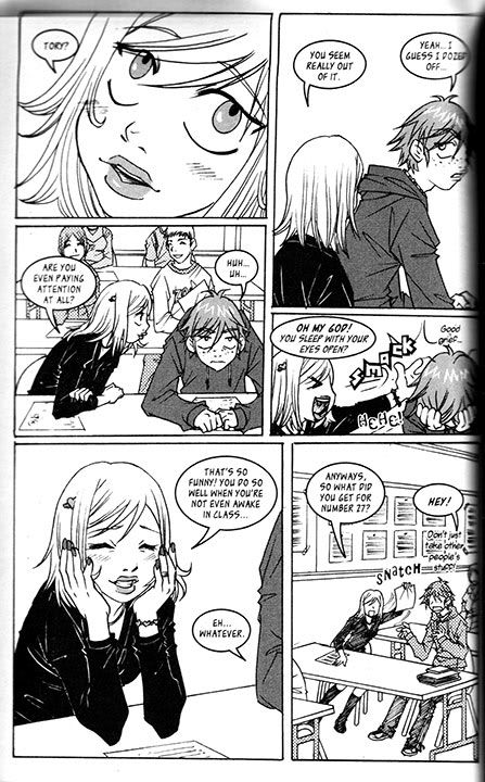
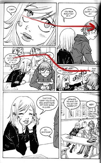
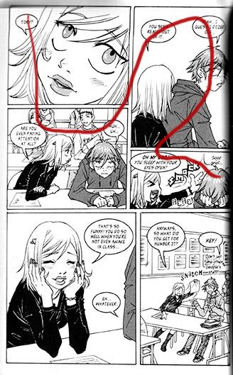
For examples: here is the original page, at a size large enough to read the text. This is how I want to read it - the eyes looking over to the next panel, along with the text balloon in the next panel at eye level drags my gaze over to that one. However, this is how the text makes much more sense. I think she needed to push the face over to the left, and have the speech bubble in the first panel perhaps overlap the panel boundary between the first and second panels to make it obvious.
This sort of thing may not seem like a problem to you, but every time I have to stop, back up, and figure out what order I'm supposed to be reading the panels in, is yet another time that I'm pulled out of the story and thinking about the format and not the characters. Quick doesn't do it often, but it happens a few times during the course of the book.
I also get hit with a couple of art pet peeves - her style is such that her characters all have receding chins, which bugs me (but it's a pet peeve with me, and not an artistic problem with her), and she's a bit inconsistent with the head shapes - soemtimes the characters have enough room for their brains, and sometimes the crown of the head is too small.
The story is engaging, and although I was slow to warm up to Tory, the main character, I eventually grew to like him. It took a bit to figure out that the older guy hanging out in Tory and his mom's apartment was a college-age neighbor and not a relative of some ilk - it's not explained until later. And the girl who shows up and sticks with Tory for the second part isn't really defined enough for me to think of her as anything other than Girl Character # 9, but maybe that will change in the next volume.
At any rate, the story's engaging and I'm looking forward to the next in the series.
As for Dramacon, it's going to get shorter shrift because the wahsing machine just stopped and once I get the laundry into the dryer, I'm going to bed. It's much more like traditional manga. It's got standard shoujo paneling, where the panels are often more like mild suggestions than rules, the backgrounds are sketchier than shounen manga, shoujo tones are everywhere, and the emotional dial is turned up to 11.
If you've been to a con, the setting will be quite familiar to you. :) Chmakova depicts it quite well, and manages to avoid the cliche about stinky fanboys. OK, anyone who's been to a con knows that they're quite real and ubiquitous but honestly, I'm tired of hearing about them. :)
No scanny for me on this one, because chapter 3's up at Takuhai Online and you can go look for yourself. You can see where the shoujo influences are. :)
The text balloon placement works a bit more like traditional manga in this one, dragging your eye through the page, but there's still places where the movement in the balloons is so strong that you miss the artwork. Look at page 57, the first page in the preview with text on it. The balloons start off in panel 1 taking your eye around and down to panel 2, then into panel 3 and ascross to 4, but then... your eye is immediately drawn to the question-mark baloon in 6 and the fleet of balloons in 7, sompletley missing panel 5, which is a fairly important emotional-reation panel, and explains the puzzlement in panel 6.
On the next page, we get panel 1 with the text all on the right, sort of missing the gir;'s figure on the left, then it takes you through the middle of panel 2, without taking the eye over the faces of both the characters. The text in panel 3 leads right into the panel 4 text, which completely misses the spit-take in that panel, and then the coughing aftermath in panel 5. I think that Chmakova is also suffering a wee bit from the (completely understandable!) desire not to obscure the artwork with text balloons -many manga do not suffer from this, hell, look at Death Note where it's next to impossible to get full character reference of someone's head from one page because they slap text balloons over half the face - but that means that the visual flow suffers a wee bit. It's not bad by any means - the manga's eminently readable - but it could have been just that little bit better.
The story's interesting; nothing too out of the ordinary, but I liked the characters. The main character got a bit tiresome in her timidity partway through, but it comes to a satisfactory ending.
I have to say, though, that my one big beef with the book is that we never get a non-chibi, non-exaggerated picture of the main character until page 11. I had no idea what she really looked like until than, and it really bugged me. Yeah, she's on the cover, but I think she really needed to be normal in at least one panel much earlier. Other than that, the artwork is dense, crowded, and claustrophobic, however that reflects the main character's experience of the con and the events occurring, so it's a good stylistic choice.
And now to bed. Er, to laundry. Then to bed.
And I have to get to bed early tonight, because tomorrow is Thursday and this means I have to get into work early enough to beat all the student circling the parking lot like vultures, if I don't want to park four blocks away from campus.
I enjoyed both of them. The art is better and more consistent in both of them than in a recent OEL release that shall remain nameless. Quick had a few problems here and there with perspective, but it's probably only people who are looking for that sort of thing (like me!) who notice it. Her art and layout style is slightly closer to American indie comics than Chmakova's is - the panel layout was reminiscent of manga, but with no clear lines of visual flow in many places. This wasn't needed for most of it - falling back on the old "left to right, then up to down" worked for the msot aprt, but every so often I'd hit a page where I couldn't tell what order to read the panels in. Playing with the gutter space to indicate more clearly which panels were grouped together would have worked here.
For examples: here is the original page, at a size large enough to read the text. This is how I want to read it - the eyes looking over to the next panel, along with the text balloon in the next panel at eye level drags my gaze over to that one. However, this is how the text makes much more sense. I think she needed to push the face over to the left, and have the speech bubble in the first panel perhaps overlap the panel boundary between the first and second panels to make it obvious.
This sort of thing may not seem like a problem to you, but every time I have to stop, back up, and figure out what order I'm supposed to be reading the panels in, is yet another time that I'm pulled out of the story and thinking about the format and not the characters. Quick doesn't do it often, but it happens a few times during the course of the book.
I also get hit with a couple of art pet peeves - her style is such that her characters all have receding chins, which bugs me (but it's a pet peeve with me, and not an artistic problem with her), and she's a bit inconsistent with the head shapes - soemtimes the characters have enough room for their brains, and sometimes the crown of the head is too small.
The story is engaging, and although I was slow to warm up to Tory, the main character, I eventually grew to like him. It took a bit to figure out that the older guy hanging out in Tory and his mom's apartment was a college-age neighbor and not a relative of some ilk - it's not explained until later. And the girl who shows up and sticks with Tory for the second part isn't really defined enough for me to think of her as anything other than Girl Character # 9, but maybe that will change in the next volume.
At any rate, the story's engaging and I'm looking forward to the next in the series.
As for Dramacon, it's going to get shorter shrift because the wahsing machine just stopped and once I get the laundry into the dryer, I'm going to bed. It's much more like traditional manga. It's got standard shoujo paneling, where the panels are often more like mild suggestions than rules, the backgrounds are sketchier than shounen manga, shoujo tones are everywhere, and the emotional dial is turned up to 11.
If you've been to a con, the setting will be quite familiar to you. :) Chmakova depicts it quite well, and manages to avoid the cliche about stinky fanboys. OK, anyone who's been to a con knows that they're quite real and ubiquitous but honestly, I'm tired of hearing about them. :)
No scanny for me on this one, because chapter 3's up at Takuhai Online and you can go look for yourself. You can see where the shoujo influences are. :)
The text balloon placement works a bit more like traditional manga in this one, dragging your eye through the page, but there's still places where the movement in the balloons is so strong that you miss the artwork. Look at page 57, the first page in the preview with text on it. The balloons start off in panel 1 taking your eye around and down to panel 2, then into panel 3 and ascross to 4, but then... your eye is immediately drawn to the question-mark baloon in 6 and the fleet of balloons in 7, sompletley missing panel 5, which is a fairly important emotional-reation panel, and explains the puzzlement in panel 6.
On the next page, we get panel 1 with the text all on the right, sort of missing the gir;'s figure on the left, then it takes you through the middle of panel 2, without taking the eye over the faces of both the characters. The text in panel 3 leads right into the panel 4 text, which completely misses the spit-take in that panel, and then the coughing aftermath in panel 5. I think that Chmakova is also suffering a wee bit from the (completely understandable!) desire not to obscure the artwork with text balloons -many manga do not suffer from this, hell, look at Death Note where it's next to impossible to get full character reference of someone's head from one page because they slap text balloons over half the face - but that means that the visual flow suffers a wee bit. It's not bad by any means - the manga's eminently readable - but it could have been just that little bit better.
The story's interesting; nothing too out of the ordinary, but I liked the characters. The main character got a bit tiresome in her timidity partway through, but it comes to a satisfactory ending.
I have to say, though, that my one big beef with the book is that we never get a non-chibi, non-exaggerated picture of the main character until page 11. I had no idea what she really looked like until than, and it really bugged me. Yeah, she's on the cover, but I think she really needed to be normal in at least one panel much earlier. Other than that, the artwork is dense, crowded, and claustrophobic, however that reflects the main character's experience of the con and the events occurring, so it's a good stylistic choice.
And now to bed. Er, to laundry. Then to bed.
no subject
no subject
no subject
no subject
Ha ha, you'll probably find _me_ pretty tiresome, then! Ah well, can't win them all.
Hi, my name's Svetlana, I did Dramacon :D Thanks for the review, I enjoyed reading your insights!
no subject
I think if the story had been published in serial form in a magazine, I wouldn't have been bugged by her timidity since I wouldn't have read it all at nce, but I inhaled the thing in one sitting (you'll be glad to note that I couldn't put it down XD), so the whole story was fresh in my mind at once. Others who read more slowly might not have the same perception.
no subject
I am indeed very glad to note that! LOL
>And you can tell my biases abut visual flow and text-balloon >placement.
Ha ha! Actually, I agree with a lot of what you said (and disagree with the rest, but hey, what fun would it be if we all agreed on everything, eh?) So, really, thanks for reading and for the feedback! I took notes :D
no subject
Yup, we all look for different things out of manga and books and movies and whatnot. I tend to be a character-over-all person and if I don't get into the characters, it doesn't matter how well-realized everything else is, I just can't get interested in the book/comic/movie. In manga, especially now that I've been doing my manga analyses on LJ, I can't not look for things like the visual flow and making the reader's eye go from one speech balloon across the important part of the panel to the next balloon, and I really enjoy it when someone pulls off a tricky path. In Fruits Basket, I love it when the visual flow takes your eye on a roller-coaster ride and you end up reading backwards from the main flow for a bit - it feels smooth and flowing and natural to me - but I've talked to other people where that sort of thing bugs the hell out of them and pops the right out of the story.
To get me to not look at the visual flow like that, the mangaka has to structure the story, art, and balloons in such a way that it isn't important - Death Note has a much more subtle flow, and signals continuity with other means, for the most part. (If there's two separate speech balloons in one panel, your eye will still usually be forced across the important bit of the panel - usually someone's face and their expression or reaction - when you go from one balloon to the other, but the overal flow of the page is rarely signalled through the speech balloons.)
Er, sorry. I can get sidetracked into blathering about this sort of thing at the drop of a hat. XD
no subject